
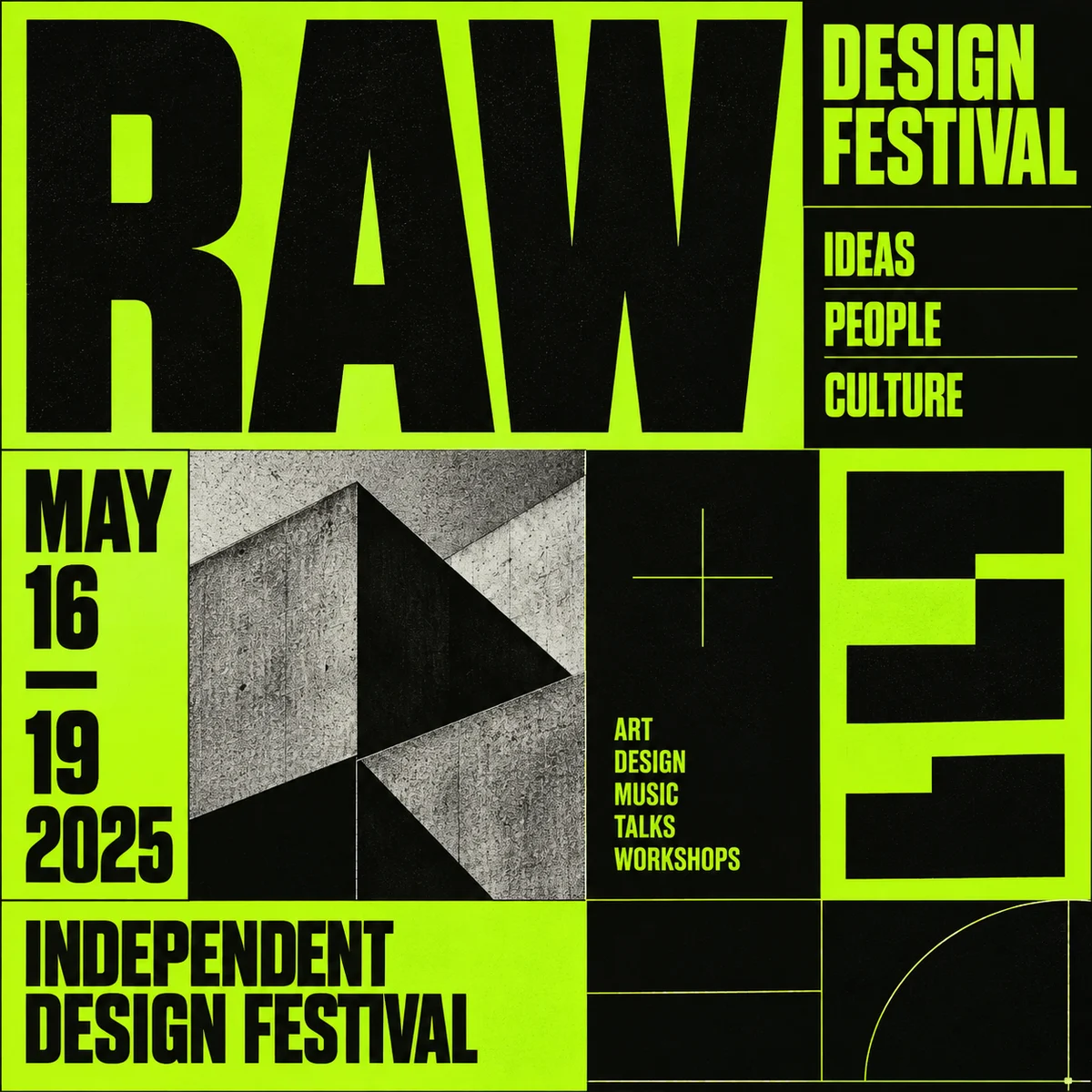
Neo-brutalist poster
Raw type, blunt boxes, and abrupt scale shifts create a deliberately confrontational layout.
Neo-brutalist graphic treatment with oversized utilitarian type, exposed alignment rules, blunt rectangular blocks and stark lime-black contrast.
A starting point: add your own subject or details in your image tool.
About this aesthetic and its examples
Compare more directions
Explore other approaches for this kind of project.
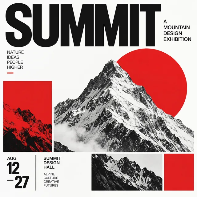
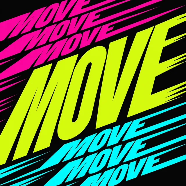
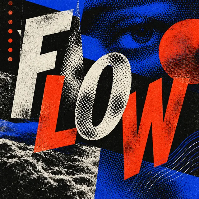
Look closer: traits and nearby styles →
About this example
This image may have used extra directions. The seed above is a reusable starting point and may produce a different result.
- Created with
- image_gen__imagegen
- Model
- Not exposed by tool
- Generated
- 2026-09-27
How to use this promptRead as Markdown
What makes this a brutalist poster?
Oversized utilitarian type, blunt rectangular blocks and exposed alignment make the graphic structure immediately visible. Abrupt shifts in scale and strong contrast create a deliberately direct, sometimes confrontational hierarchy.
The first example is an event poster. The variation organizes a fictional fundraising message as a stepped typographic composition. Compare how blocks, spacing and type scale carry the message; a different subject or brighter color alone would not demonstrate another direction.
In the stepped fundraising poster, read the large vertical BUILD lettering before following the smaller amounts diagonally across the page. The large empty areas separate the blocks. Its evenly stepped layout does not encode the listed amounts proportionally, so use it to study hierarchy rather than as an accurate fundraising chart.
To explore your own poster, choose a short headline and one secondary message. Change the block sizes and the reading path, then check whether the main message remains readable at thumbnail size. Add dates and detailed information after you have checked the layout and every generated letter.
Compare Swiss grid design for a more measured typographic hierarchy, or New Wave typography for disrupted grids and a more layered reading path. All three can use strong type; their handling of alignment, scale and spacing produces different effects.
This is a graphic interpretation, separate from Brutalist architecture. The generated lettering and figures are part of a fictional example: proofread and verify any information before adapting an image for a real event.
Look closer at Neo-brutalist poster
Raw type, blunt boxes, and abrupt scale shifts create a deliberately confrontational layout.
In the original generated example: Oversized RAW lettering and blunt black boxes on a lime-green poster. Notice which details catch your eye before deciding whether the whole style is for you.
Explore across projects: Letters with personality
Ask yourself: is it the palette, the surface, the shapes, or the subject you like? Save a favorite and use the visual taste guide to find a useful next direction.