Risograph
Grainy ink, overlapping colors, and the beautiful imperfections of a printed page.
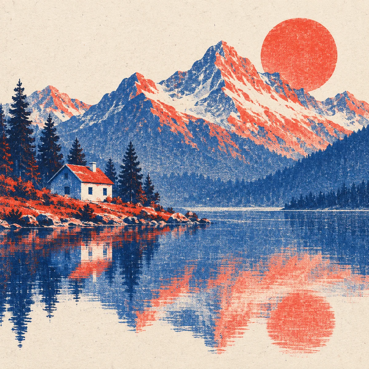
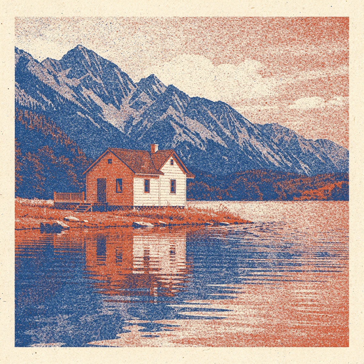
Two-color risograph print with grainy ink texture, overlapping color layers, and off-white paper.
A starting point: add your own subject or details in your image tool.
About this aesthetic and its examples
Compare more directions
Explore other approaches for this kind of project.
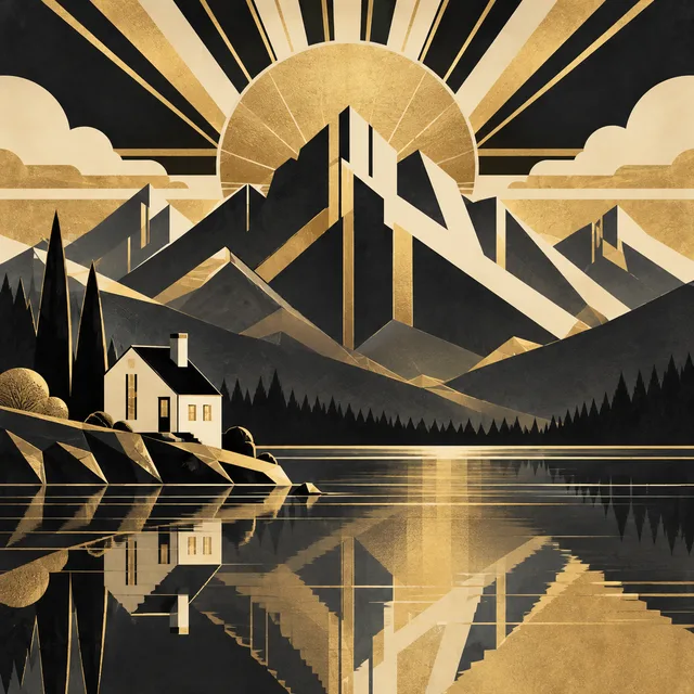
Look closer: traits and nearby styles →
About this example
This image may have used extra directions. The seed above is a reusable starting point and may produce a different result.
- Created with
- Codex image generation
- Model
- Not exposed by tool
- Generated
- 2026-09-25
View model alternatives · Compare results →
How to use this promptRead as Markdown
Explore ink layers, overlaps and paper texture
A Risograph makes a stencil for an ink drum and builds an image through separate color passes. Riso Pop’s process guide explains why planning a small set of ink layers matters. Overlaps can create new color relationships; imperfect alignment is only one part of the visual language.
Compare the landscape and pear print, then inspect the tool results below. Look for whether grain follows the colored areas, whether overlaps remain readable and whether the palette feels deliberately limited. A strong result should do more than place random noise over a smooth illustration.
For a fresh exploration, keep the subject simple and ask for two contrasting ink colors, an open paper ground and deliberate areas of overlap. Change the placement of the shapes before adding more colors. Use the comparison prompt to explore how another tool interprets the same direction.
These generated images simulate a printed appearance. They are not physical prints or press-ready color separations. For a real edition, work with a printer on ink choices, separations, registration and paper.
Learn more: Riso Pop: how Risograph printing works
Look closer at Risograph
Grainy ink, overlapping colors, and the beautiful imperfections of a printed page.
In the original generated example: A lakeside house and mountains in a grainy two-color risograph print. Notice which details catch your eye before deciding whether the whole style is for you.
Explore across projects: Beautiful imperfections · Less color, more character
Ask yourself: is it the palette, the surface, the shapes, or the subject you like? Save a favorite and use the visual taste guide to find a useful next direction.
One aesthetic · Different interpretations
Risograph
Two-ink overprinting, print grain and restrained color.
Each image uses the same example prompt. Compare the details you’d carry into your own image.
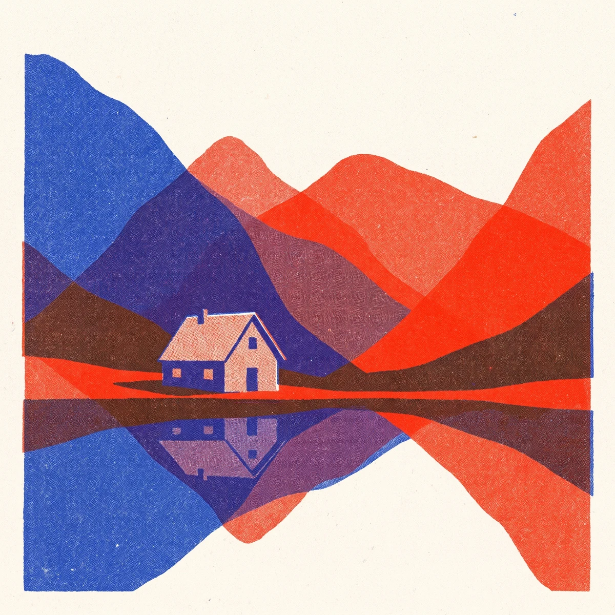
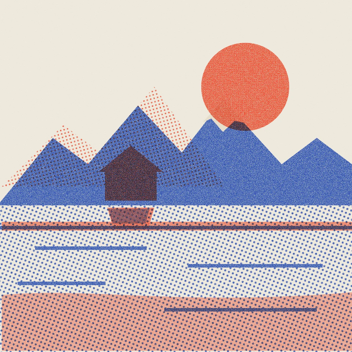
Explore a coded SVG interpretation · Anthropic Claude
This illustration was written as SVG code from the same prompt. Compare its shapes and arrangement as a different visual medium.